
Keep the Font and Background: What Image Text Editing Can Really Preserve
Illustrative serif and patterned-background examples explain approximate font matching, pixel restoration, scaling and the limits of changed-area checks.
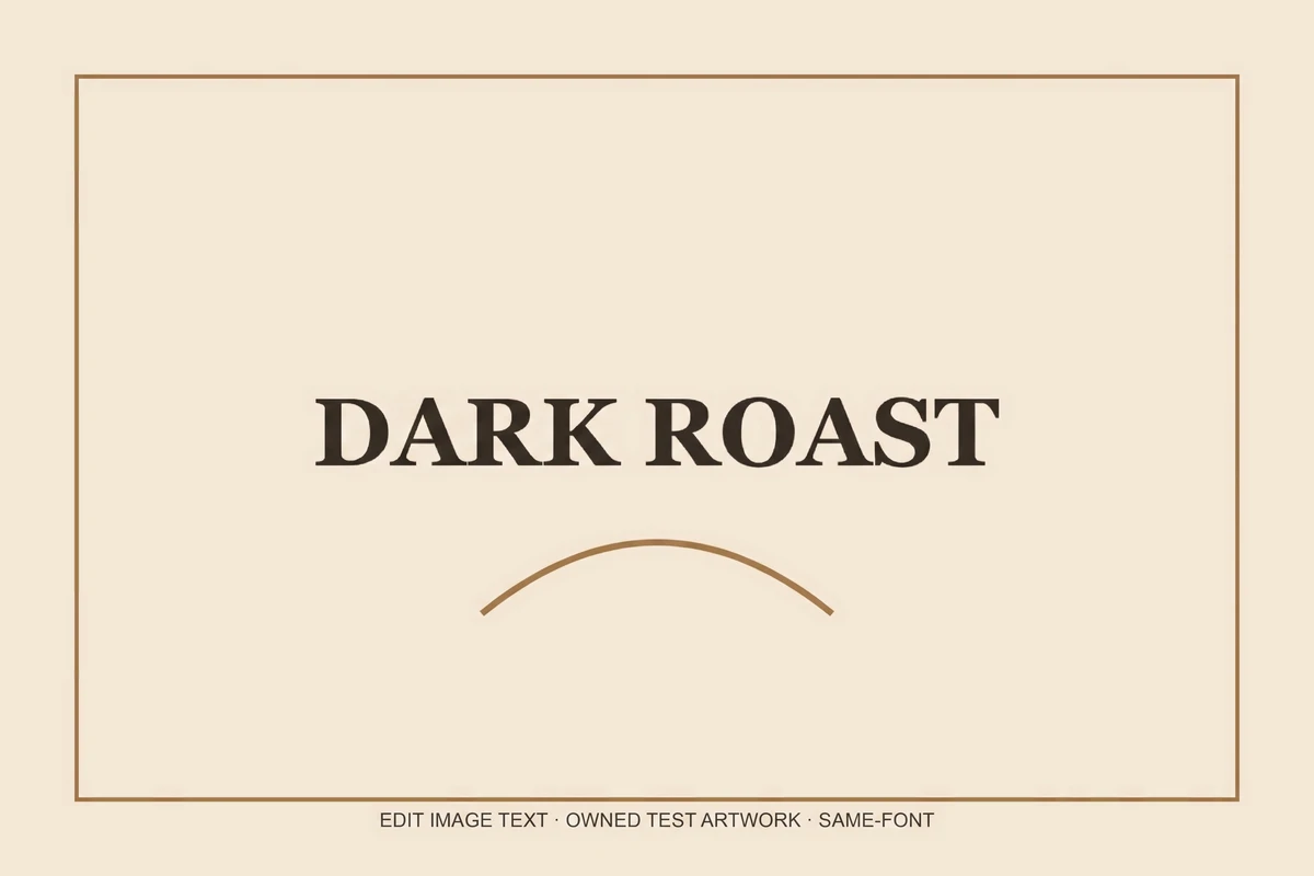
“Keep the same font” sounds like a font lookup. In this editor it is a different process: the image model sees the lettering in a picture and attempts to redraw the replacement in a similar visual style. It does not identify, install or license the original typeface.
This distinction matters when a result is used for a logo, printed packaging or strict brand work. An attractive approximation may still have the wrong serif, counter shape, baseline or spacing. If exact typography matters, use the actual licensed font and the source layout.
The images below are inherited from the backend example set. They illustrate review techniques and are not EditText production measurements.
An illustrative serif replacement
The source illustration contains BOLD ROAST, set as large display lettering on a flat graphic. Its edited version reads DARK ROAST. Compare the broad serif appearance and the individual letter shapes.
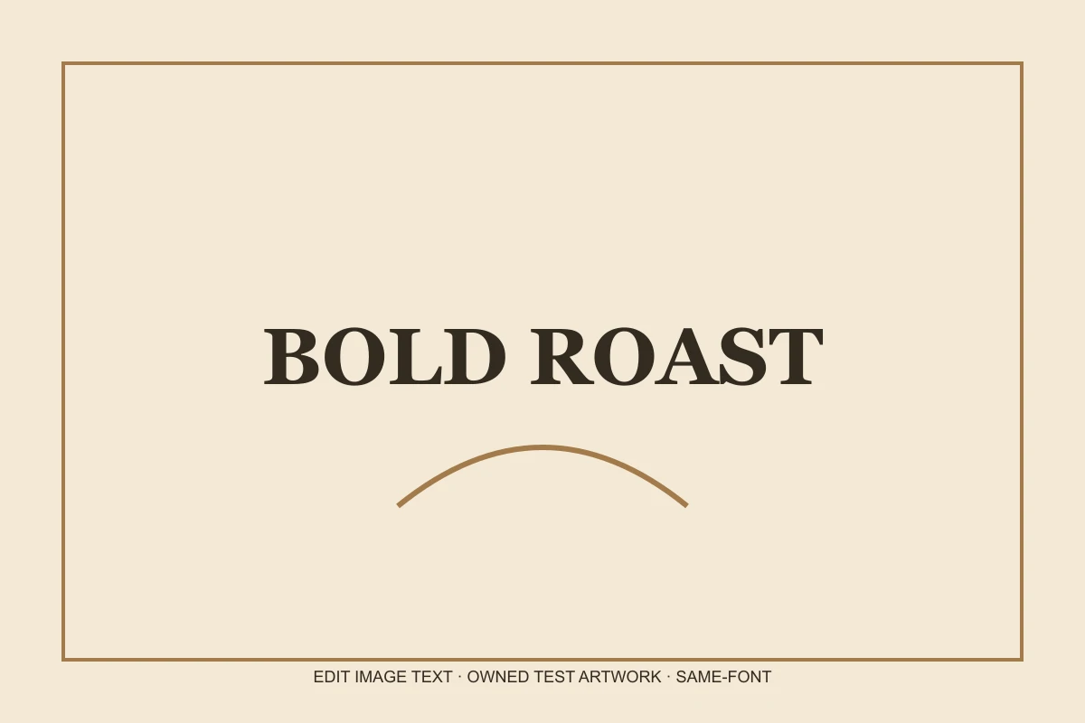
Inherited example artwork, before and after. These images illustrate the editing task; they are not measurements of EditText production. The serif appearance is similar; no font file was identified and exact glyph or kerning identity is not established.
The changed-area estimate describes pixels that exceeded the browser check’s threshold, not how closely a typeface was matched. It is not a font-identification score and cannot establish that the new characters share identical outlines with the original font file.
When reviewing a replacement, look at repeated letters first. Compare stroke weight, curved counters, the tops of capitals and the space between letter pairs. Then inspect characters that were not present in the old phrase: those require the model to infer shapes from limited evidence.
Inspect the homepage editing examples, or try matching your own image’s lettering.
What background restoration actually does
The model is asked to change only the named phrase. That request can fail: a generative model may redraw the surface, alter colors or shift the framing. The browser therefore compares the result with your uploaded original.
When the image shape is close and the changed area is contained, the compositor keeps the original outside a softened mask around the differences. The soft boundary helps avoid clipping new strokes. This is a pixel-based heuristic, not an understanding of which pixels belong to a word.
A small color shift can fall below the difference threshold. A compressed or rescaled image can introduce differences that are unrelated to text. When the measured change is broad, the editor warns that it cannot safely restore the original automatically.
A repeating pattern is a harder case
Another illustration changes WEEKEND SALE to SPRING SALE over diagonal lines. The target phrase is present, but the local pattern is not an exact reconstruction. Examine the nearby texture closely.


Inherited example artwork, before and after. These images illustrate the editing task; they are not measurements of EditText production. The requested phrase is legible, but the diagonal pattern close to the new letters is not an exact reconstruction.
A changed-area check can classify an edit as contained while local texture differences remain visible. A “restored” status is not a guarantee of visual acceptability.
Repeating patterns, knitwear, brickwork and edges passing behind text are difficult because the original hidden surface is unknown. The model supplies an estimate. If exact continuity is required, source artwork or a careful manual reconstruction is more reliable.
Review the repeating-pattern illustration above before using the background-preservation editor.
Resolution and preservation are separate questions
The Pro model is requested at its 2K tier. Output dimensions depend on the provider and aspect ratio. The editor retains the larger working size for download when a model result is larger than the input.
The unedited background is nevertheless derived from the original input when restoration is applied. Scaling a small source does not add new captured detail. At the edge of an edited word, generated and scaled source pixels can have different sharpness or grain.
Check both the typography and the background at full size. Then reduce the image to its intended display size. A seam that is visible at 400% may be irrelevant for a tiny web graphic, while a wrong letter remains a wrong letter at any size.
A practical acceptance checklist
- Read the complete replacement, not just its general shape.
- Inspect other text, logos and straight edges near the edited region.
- Compare repeated letters and their spacing.
- Turn on the change highlight and inspect the mask boundary.
- Check actual output dimensions and any low-resolution warning.
- Keep the untouched original and reject the result if the change is too broad.
Our same-font page and background-preservation page explain the editing workflow and its limits. The practical editing guide explains why receiving a file and approving its visual quality are separate steps.